Decipher Quadrichromia Printing Process
Behind the Scenes
[vc_video link=”https://youtu.be/CdcJb9YydgQ?t=4″ align=”center”]Back to Greece
Ethymology
“Quadrichromia” emerged at the end of the 19th Century. The origin of the word is from the Latin root, quadri, which means “made of four” and from the Greek word, chromia, which means “color”. The technical foundations were laid in the 18th Century by Jacob Christoph Le Blon. The industrial process was adopted by the Press, which began to widely use the four-color process from 1880 onwards.
A qualitative Process
Quadrichromia: What is it?
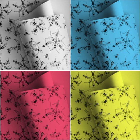
The Quadrichromia printing process, more commonly referred as the CMYK color printing process, is based on four colours: the three primary colours: blue (cyan or “C”), red (magenta or “M”) and yellow (“Y”). The colour black is used to reinforce the contrasts and to print the text and is reffered as key (“K”).
The four-color printing process allows to control the colour dosage and reproduce the desired colors with fine precision. The result is superior to a digital printing, since the ink is deposited in successive layers and is immediately dried at the outlet. This process gives a real depth to the colours and is considered of superior quality.
A step-by-step Process
Printing Process
In order to reproduce a coloured image on a printed page, it is necessary to decompose it into basic colors. Each color is printed successively on the paper, which is going through the different colours plates: red (magenta), yellow and blue (cyan). In order to match the original colours, during the printing process, a complementary color filter is used on each plate: purple filter to select the yellow, green filter to select the red, orange filter for the blue colour. The colours are printed one after the other, supperposing the layers of colours to render subtle nuances.
To restore to the eye an image identical to the original, the plates are printed by exact superposition with the inks: cyan, magenta and yellow. The black color is mainly used to strengthen the drawing and increase the intensities in the dark parts.
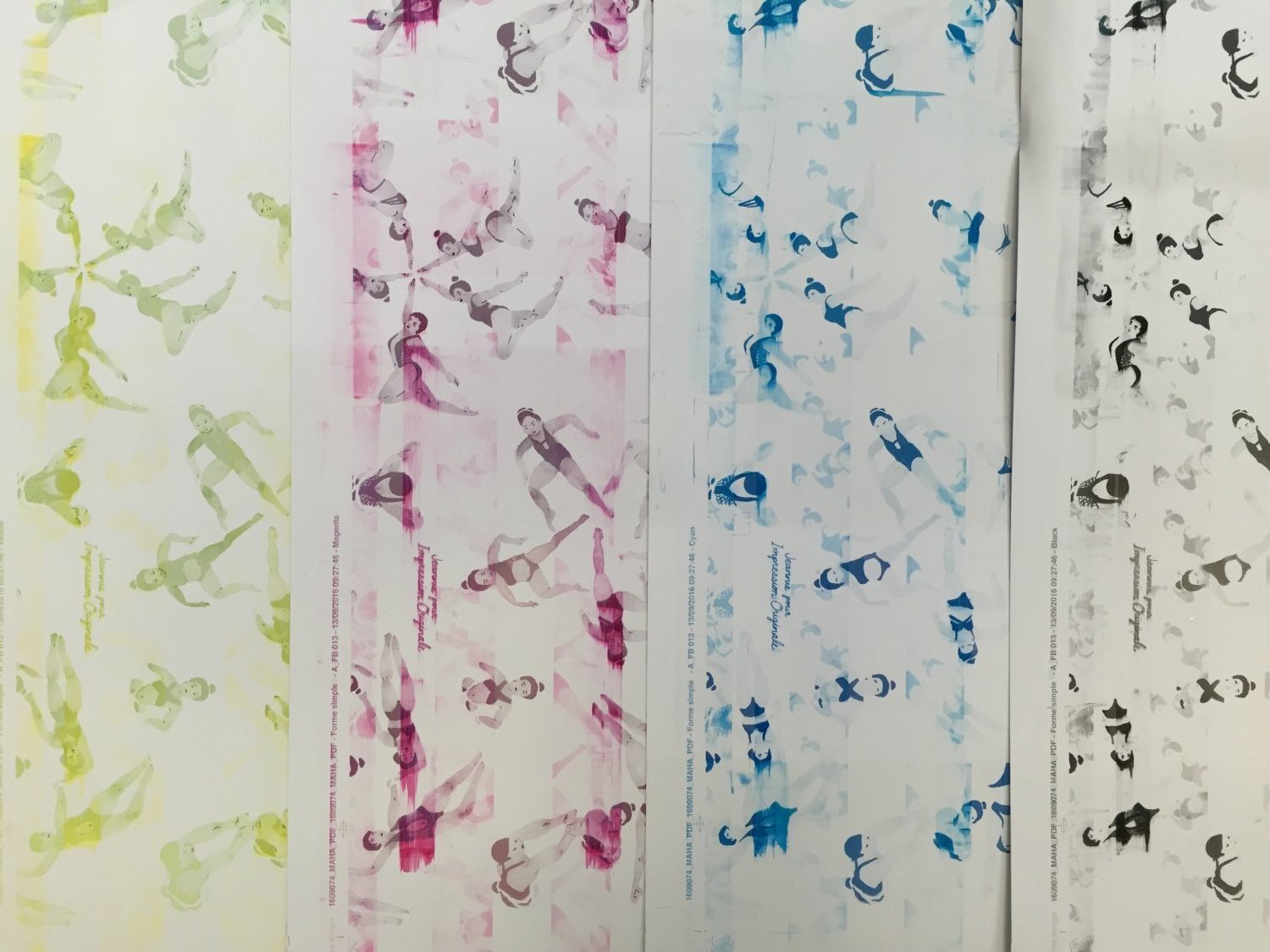
Primary Colours + Black
How do we achieve the perfect nuance?
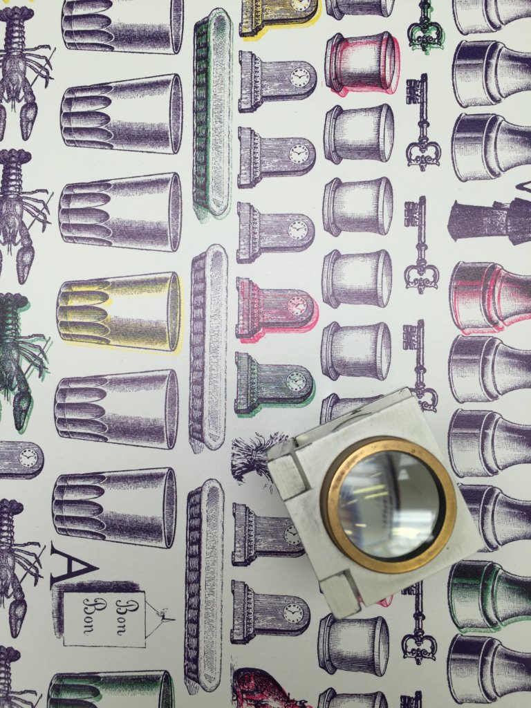
With CMYK printing, halftoning (also called screening) allows for less than full saturation of the primary colors; tiny dots of each primary color are printed in a pattern small enough that human beings perceive a solid color. Magenta printed with a 20% halftone, for example, produces a pink color, because the eye perceives the tiny magenta dots on the large white paper as lighter and less saturated than the color of pure magenta ink. Based on the nuance of the desired colour, the ink is deposited in more or less dense sizes of dots.
Moreover, to improve print quality and reduce moiré patterns, the screen for each color is set at a different angle. When using a printing magnifier, we can distinguish the micro dots and the angles of each of the four color.
A Cumbersome Process
The Technical Constraints
The first limit of the process of the CMYK Printing is a lack of flexibility in the sense that each print requires an incompressible preparation time especially for the etching of the four plates which will be used for printing. CMYK printing is therefore not suitable for small amounts of prints (less than 800 sheets).
The second limit is linked to the brightness of some colours. Although as mentioned, the color palette can be almost infinite, some colours may lack intensity. It is the case, for the colour orange, pink, red and for fluorescent colors that are not reproducible using the CMYK process. In this case, the use of standardized ink (PANTONE ©) is recommended for optimized results.
One step farther
Bibliography
Mark Gatter, Getting it right in Print / Digital Pre-press for graphic designers (online).
 English
 Français